posted: Tuesday, 05 May 2009
I've been making more of my new stars so that I have some to show students in my classes this week.
Now that I have a much bigger stash of rivolis and size 15 Delicas (thank you The Bead Merchant) I am really having fun choosing colours and seeing how different colours, shades finishes etc work in different places on the design.
Writing my new book recently, involved a chapter on using colour in your jewellery and I had to actually sit down and swot up the rules of colour to make sure that what I was writing was actually true and not my mis-interpreted version on them.
It was really interesting and it inspired me to want to play with colour combinations I never use. One of these I did with the fish I just finished- I don't think I have ever used red and blue together. In fact I rarely use blue at all- teal, turquoise, aqua etc- yes, blue- no.
So I was really surprised when it worked and not only that- I liked it.
Using colour is something a lot of beaders are frightened of and I have to say that for me the main rule is use what YOU like- don't worry about any other rules.
But, if you do want some guidance here is some basic colour information with examples:
Primary Colours
These are the main colours: blue, yellow and red. They're called this because they can't be made from any other colours.
Secondary Colours
These are colours made when you mix the primaries: green (from yellow and blue); violet (from red and blue); and orange (from red and yellow).
Black and white
Although technically not colours, black and white are often put in the primary colour category as they are basic colours used to enhance others. Adding black to a colour darkens it whereas adding white lightens it.
If you are looking for colour help then knowledge of the 'rules' and schemes etc can help you to make choices and your most useful tool will be a colour wheel.
One great way to try these out if to begin with one bead or colour and apply the different schemes to it to see what you like the look of.
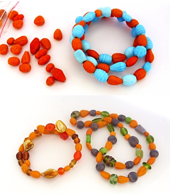
Here I have begun with some orange beads and then matched them with different colours to explore some schemes. orange was the perfect choice as lots of people shy away from using it but paired with the right choices it can become more subtler and a great one to use.
The schemes I used were:
Complementary
Also often called contrasting. This works on the theory that colours opposite each other on the colour wheel work well together; red and green, yellow and violet, and, in this case, orange and blue. In complementary combinations both colours work with each other with the result that the orange and blue beads both look strong.
Analgous
These schemes use two or more colours that sit next to each other on the colour wheel. for this I matched the orange beads with yellows and reds etc which work to tone down the bright orange.
Split-complementary
This is your first colour combined with the two colours that sit either side of its complement. In my example I used green and violet beads in combination with the orange ones which were toned down as a result.
Now- so many things can effect the results too- the finish on your beads, what ratio of each colour you use etc but I hope you can see that once you know a few simple rules you can really dive in and play around but still have some idea of where to begin.
If you want to learn more about colour then Margie Deeb's books are a great place to start- especially as she lists the numbers of Delica beads to fit the schemes she gives you- a really useful addition which you can use to help build up your bead stash!
some other useful colour websites are:
Using black and white in jewellery making
Colour theory and jewellery design
Colour schemes in jewellery design
Colour theory basics
and one of my most favourite sites of all: Colour Lovers
Check back tomorrow to see the finished results of my lastest colour experiment!
