posted: Wednesday, 12 June 2013
Although I'm keeping my beading hidden at the moment I can at least show you some of the colours I'm using.
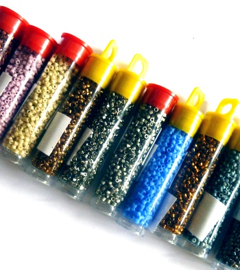
The main one I'm in love with is a dark grey from My Favourite Delicas 2 set. It works great as a neutral and a foil for some of the brighter colours I'm putting with it. But, unlike black or white it's not so harsh, overpowering or visually jarring. When putting the set of beads together I purposely put in 9 different variations of grey (or silver) along with colours with a grey tinge to them.
I have used grey as a neutral quite a few times before such as in my Freeform Cuffs and it works really well. Grey is often seen as boring or plain but I think it's a great complement or backdrop to other colours and to my eyes adds a pleasing enhancement without fighting the other colours.
I often wonder why it's not used more in beading or fashion etc in general but then it has many negative associations for some people. The meaning behind grey contains lots of words such as reliable, conservative and solid but the addtion of old age, boring and sad means that many people don't like to wear it.
I remember back in 1998 grey was predicted as a big fashion colour but its use nearly brought the downfall of Marks & Spencer. On pages 41 and 42 of this document, under the heading 'What Can Go Wrong' a spokeswoman for M&S gave the following account of the 1998 autumn season: ‘Grey was the fashion colour so we bought into it, but the mistake was that we bought it for everybody. Older customers wanted colour and we were missing it. . . By the time we realised, it was too late to buy more colour. We’d had a very successful year previously, so we were confident and bullish about buying. On reflection we bought too much fashion and too much grey . . . ’
Maybe if the shoppers who were turned off by grey had seen some of these great grey palettes and thought about adding their own touches of colour they would have snapped the clothes up.
